The 4 Main Parts of a Website
Having a website is a great way to promote your business. However, there are several parts that you need to keep in mind when creating one. These are the Header, Footer, Sidebar, and Body.
Header
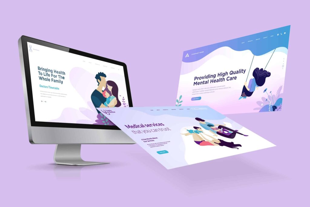
Whether you’re designing a brand-new website or refreshing the look of an existing one, it’s important to pay special attention to the header of the page (Hero Section). This area of your website is the first impression that you make on your visitors. Whether they’re new or returning, the header is a place where you can introduce them to your products and services. It’s a place where you can also give them important contact information.
Header/Hero designs vary, but it’s important to make sure your header is a balanced, coherent design that is appropriate for your audience. You don’t want to add too many features to your header, as this could confuse your visitors.
The header is also a good place to include a call to action. This can include a search bar, a signup option, or a contact section. These elements will help increase your lead generation.
Body
Having a well written content plan is critical to the success of any web site. In addition to showcasing your wares, your site should also be an informational hub, and it’s your job to ensure your visitors are kept up to date and on the same page as you. To that end, you should consider the following: what type of content do you want to display, what type of content is best suited for what type of content, and what type of content should be hidden away? It’s also important to understand your visitors’ needs and preferences, as well as the best way to present this information. Keeping visitors on your site is a top priority for any web developer. Thankfully, there are many ways to do this.

Sidebar
Often, the sidebar of a website can become cluttered with junk. The purpose of a sidebar is to complement the content of the page and keep readers engaged. However, cramming too many things in the sidebar can make readers feel overwhelmed.
To make your sidebar work, first consider its placement. It should not be the largest component of your website. It should not be placed at the bottom of your page. It should be placed on the right or left side of the page.
If you have a sidebar, it may have a search box, links, advertisements, or other content. Depending on your theme, it may be on the left or right side of the main content.
The best sidebars are the ones that engage visitors and monetize them. You should not just put ads in a sidebar, however.
Footer
Having a well-designed and professional footer on your website can improve its usability. It can make a good first impression and encourage visitors to become part of your email list.
The footer is located near the bottom of your web page. It contains contact information, links to important pages, and a copyright notice. It can also be used as a navigation tool.
Your footer may include links to your privacy policy. The policy explains how data is collected and stored. It can also explain what types of data are collected. It is important to include a copyright symbol to protect against plagiarism.
In addition, your footer can include links to social media platforms. In fact, 72% of the top marketing websites include social media icons in their footers.
Sliders
Using sliders on a website is a great way to display information in a visually appealing way. This will increase user comprehension and retention.
Sliders can be used to display a series of steps that lead to the final destination, or to inform a decision. They are especially useful in the context of pricing tables. They allow users to compare different options without getting distracted by a large image or text.
To make sure your slider is a hit, use the following tips to create a slide that is easy to use and understand. Start with a clear goal. You may want to highlight a particular category, or showcase a collection of images to demonstrate your brand’s quality.
The best layouts use plenty of white space and a minimalist approach. They also use labels to help users navigate the slider. Using arrows is also a good way to make slider navigation easy.


